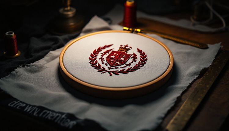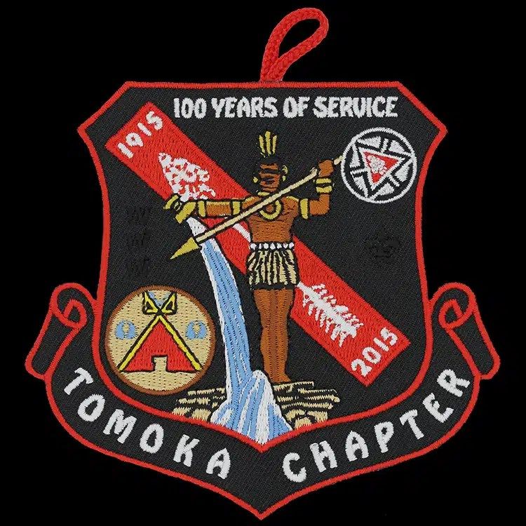
As a general guide, the smallest text an embroidered patch can hold cleanly is about 1/4 in (6 mm) tall, measured as the height of a capital letter, in a bold, simple font with strokes at least about 1 mm wide. Below that, letters start to fill in and merge. A woven patch can hold noticeably smaller text, so if a motto, a date or a long name has to stay small, woven is usually the answer.
Below we explain how to measure text on your own artwork, why small letters fail in thread, and the practical fixes when your lettering is below the limit.
How to measure text height on your artwork
Text size in embroidery is about the physical height of the letters on the finished patch, not the point size in your design software. A 10 pt font on a large artboard can end up any size once the artwork is scaled to the patch.
- Scale your artwork to the exact finished patch size, for example 3 in (76 mm) wide.
- Find the smallest line of text.
- Measure the height of a capital letter such as H or E in that line. That is the cap height.
- For lowercase text, also measure the x-height: the height of a letter such as x or n. Lowercase letters with a small x-height fail sooner than capitals.
- Measure the thinnest stroke in the letters.
A quick check without software: print the artwork at 100 percent and lay a ruler on it. Then hold the printout at arm's length and read every line aloud; anything you hesitate over needs attention.
The limits at a glance
The figures below are rules of thumb, not hard cut-offs. Font weight, spacing, thread and the digitizer's skill all shift them slightly, and the proof is the final word.
| Cap height | Embroidered result | Suggestion |
|---|---|---|
| 1/2 in (13 mm) or more | Clear, crisp, readable at a distance | Most fonts work |
| About 3/8 in (10 mm) | Clean in bold and medium fonts | Avoid thin serifs and scripts |
| About 1/4 in (6 mm) | Readable in bold, simple capitals | Use bold sans serif and open spacing |
| Under about 1/4 in (6 mm) | Letters soften, counters close | Enlarge, shorten or choose woven |
| Under about 1/8 in (3 mm) | Not reliably readable in embroidery | Woven or sublimated, or remove |
Why small letters fill in
Embroidered letters are made of satin stitches laid across each stroke. Thread has a fixed thickness, and the machine needle needs a little space between penetrations. When a stroke gets narrower than about 1 mm, there is no room for a proper satin column, so it either becomes a thin running stitch or disappears.
The spaces matter too. The holes inside letters such as e, a, B and 8 are called counters, and as thread pulls the fabric inward they shrink. In small text they can close completely, so an e reads as a blob. Gaps between letters close in the same way, which is why small words in tight spacing run together.
What helps small text stitch
- Choose a bold sans serif. Even strokes and open counters survive best. See our list of fonts that work in embroidery.
- Use capitals. At the same size, capitals are taller and simpler than lowercase.
- Open up the spacing. Add a little letter spacing and line spacing so letters do not merge.
- Give text a plain background. Text over a busy fill or a pattern loses contrast.
- Raise the contrast. Light thread on a dark field, or the reverse, reads better than two similar tones.
- Keep lines short. One short phrase can be set larger than a sentence.
Fixes when your text is too small
Make the patch larger
Every element grows with the patch. A seal that fails at 2.5 in (64 mm) may stitch cleanly at 3.5 in (89 mm). If you have flexibility on size, our patch size guide shows what fits each placement.
Shorten or move the text
A long motto around a ring can often drop to two or three words, or move to a separate banner or rocker where it has more room. A full legal name can become a short name or an abbreviation that people already recognize.
Remove the smallest text
Fine print such as an established year, a website or a trademark symbol is often better left off the patch, or made large enough to be a feature. Tiny text that cannot be read adds nothing.
Switch to woven or sublimated
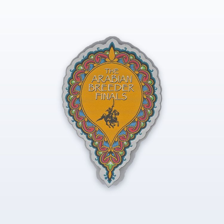
A woven patch holds much finer lettering because its thread is thinner and the text is woven in rather than stitched on top. A sublimated patch is printed, so it can hold print-sized type. Our comparison of embroidered vs woven patches explains the trade-offs in look and feel.
Common small-text cases
Ring text on a round seal. Curved lettering loses space at the inside of the curve. Give the ring enough depth that capitals reach at least the general minimum, or move to woven.
Name tapes and name patches. On a 1 in (25 mm) tall tape, capitals around 1/2 in (13 mm) give room for long names. See our guide to name tapes.
Dates and numbers. Numerals such as 6, 8 and 9 have small counters and close up quickly. Set dates a little larger than surrounding text.
Department and town names. Shoulder patches often carry a long town or agency name across a top banner. Curving the banner, splitting the name over two lines or abbreviating a generic word such as Department lets the important word stay large.
Websites and phone numbers. These are long, full of small characters and rarely read on a patch. If they matter, give them their own woven label or a printed tag rather than squeezing them into the design.
Check small text on the proof
The proof, usually 1 to 3 business days after we have your artwork, shows how each line will be stitched and flags anything below the limit. Read every word on it at the real size, and check spelling, dates and numbers. Nothing runs until you approve the proof in writing. When you are ready, send your artwork for a quote, and mention any line that must stay exactly as written.