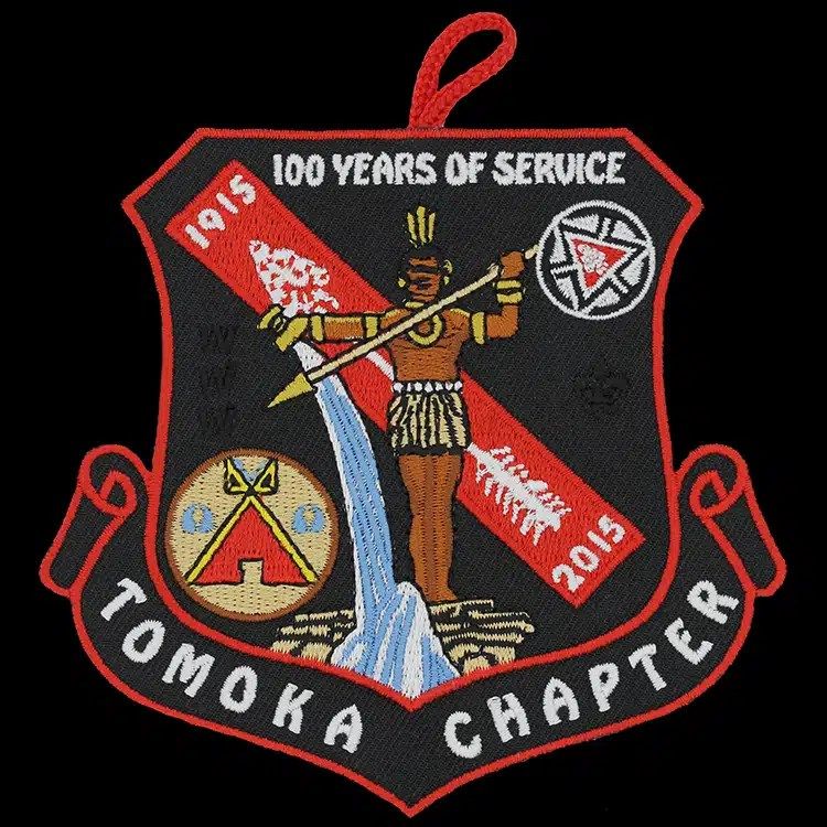
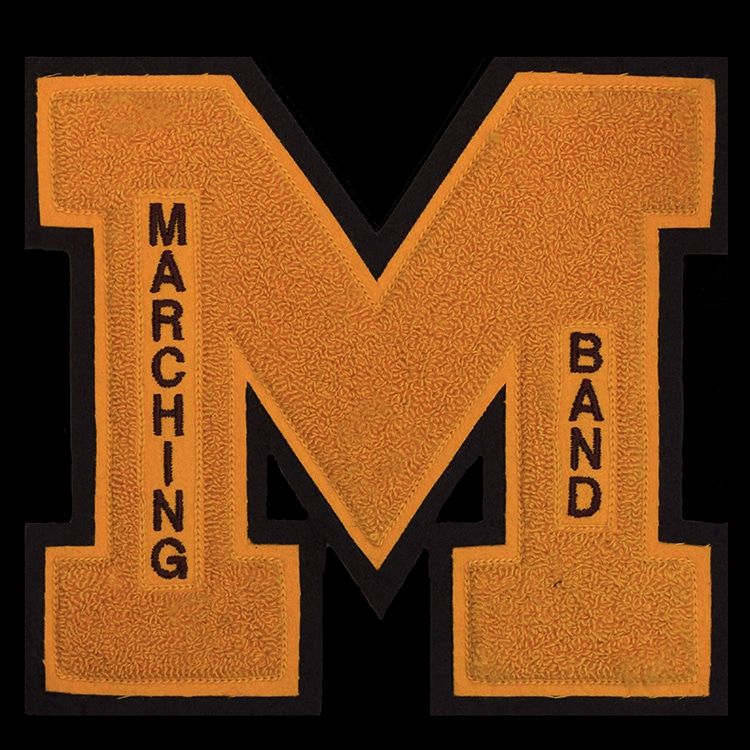
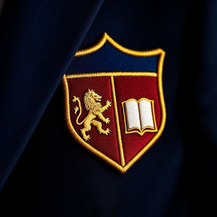
The best fonts for embroidery are bold, simple and evenly weighted: heavy sans serifs such as Arial Black, Helvetica Bold or Futura Bold, block and varsity letters, sturdy slab serifs such as Rockwell, and thick, connected scripts. They work because every stroke is wide enough to hold a satin stitch and the open spaces inside letters stay open. Thin serifs, hairline scripts, light or condensed weights and distressed fonts are the ones to avoid, especially on small patches.
Below we explain why some typefaces stitch well and others do not, go through each font family with examples, and give a few rules for spacing and size that matter as much as the font itself.
Why some fonts stitch well and others do not
Embroidered letters are built from satin stitches: long, parallel stitches that cover each stroke from side to side. That gives three practical limits.
- Stroke width. As a rough guide, a satin column needs to be at least about 1 mm wide to form properly. A typeface with thin strokes at your size simply cannot be stitched as drawn.
- Counters. The enclosed spaces in letters such as a, e, o, B and R shrink as thread pulls the fabric. In a heavy or tightly spaced font, they close up.
- Contrast within a letter. Fonts that swing from thick to very thin strokes, such as many classic serifs, lose the thin parts first, which leaves letters looking broken.
So the ideal embroidery font has fairly even stroke weight, open counters and simple shapes. Most of the time, that means a bold weight of something plain.
Font styles that work well
Bold sans serif
The safest choice for most patches. Arial Black, Helvetica Bold, Futura Bold, Franklin Gothic Heavy and similar faces have even strokes and open shapes. They suit name patches, department titles, company names and anything that must be read quickly.
Block and varsity
Collegiate and athletic block letters are made for this. Their heavy, squared strokes stitch cleanly, and they are the natural choice for chenille and satin tackle twill letters, team names and numbers. The chenille example at the top of this page shows how much weight they can carry.
Slab serif
Rockwell, Clarendon and other slab serifs have square, heavy serifs that stitch as solid blocks rather than fine points. They give a workwear or heritage look without the risk of a delicate serif.
Heavy script
Connected scripts with thick strokes, such as the bold brush or retro sign-painter styles, can look excellent, particularly as a main wordmark. Keep them large, and avoid scripts with very thin joining strokes.
Simple serif, set large
Serif fonts such as Times or Garamond can work at large sizes, for example on a 4 in (102 mm) crest banner, but the thin parts disappear at small sizes. If you need a serif for a formal crest, choose a bold weight and test it at the real size.
Font styles to avoid or use with care
- Thin and light weights of any font. The strokes are too narrow for satin.
- Hairline and wedding scripts with fine flourishes and joins.
- Condensed fonts, where the counters are narrow and close up.
- Distressed, grunge and stencil-effect fonts, whose textures turn into stray stitches.
- Outline-only fonts, which turn into thin running stitches that look faint.
- Very decorative display faces with many small details inside each letter.
If your brand uses one of these, you do not have to abandon it. Often the answer is to use the brand font only for a large wordmark and switch to a bold sans for any small supporting text, or to move the design to a woven patch, which holds finer lettering.
Font styles at a glance
| Font style | Stitches well | Best use | Watch for |
|---|---|---|---|
| Bold sans serif | Yes, at most sizes | Names, titles, small text | Tight letter spacing |
| Block or varsity | Yes | Team names, numbers, chenille | Very long words |
| Slab serif | Yes, medium and up | Workwear, heritage marks | Thin hairline joins in some faces |
| Heavy script | Yes, when large | Main wordmarks | Thin connecting strokes |
| Classic serif | Only when large | Formal crests, banners | Thin strokes vanish when small |
| Thin, condensed or distressed | Rarely | Avoid, or use woven | Broken or closed-up letters |
Size, case and spacing matter as much as the font
Even a good font fails if it is too small. As a general guide, embroidered capitals need a height of about 1/4 in (6 mm) to stay readable; our guide to the smallest text an embroidered patch can hold goes into the details.
- Use all capitals for small text. Capitals are taller than lowercase letters at the same point size, so they hold up better.
- Open up the letter spacing slightly. Thread spreads, so letters that nearly touch in your file can merge.
- Keep to one or two fonts per patch. More looks busy at patch size.
- Avoid placing text over a busy background; give it a plain field or a banner.
- Check curved text on round patches. Letters on a ring need extra room at the inner edge.
Matching fonts to the patch type
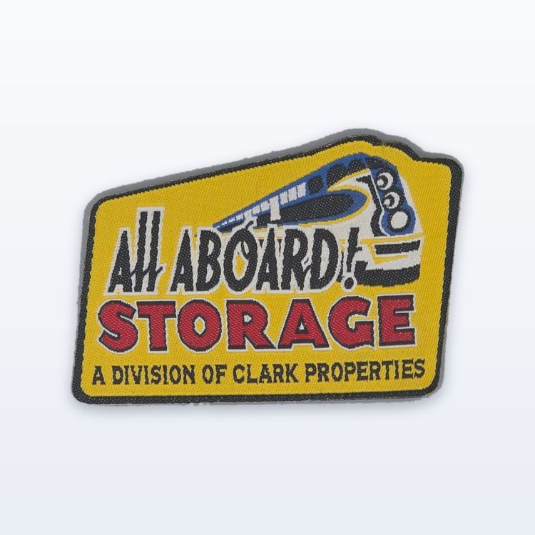
Font choice also depends on the construction. Embroidered patches need the bold, even weights described above. Woven patches hold finer type, so a lighter serif or a smaller sans can work. Chenille needs very large, simple letters because the tufted yarn is thick. Sublimated patches are printed, so almost any font works as long as it is large enough to read.
For more on lettering-led designs, see our guides to name patches and designing a logo for embroidery.
Numbers and monograms
Numerals deserve their own check. The figures 6, 8, 9 and 0 have small enclosed spaces that close up quickly, so set dates and numbers in a bold face and a little larger than the text around them. Monograms and interlocking initials look elegant in print, but overlapping strokes pile thread on thread. Give each letter its own space, or let one letter sit inside another with a clear gap around it, so every letter still reads.
Test your lettering, then request a quote
Print the patch at real size and read it from across a room. If any word is hard to make out, try a bolder weight, a larger size or fewer words. When you are happy, send the artwork for a quote, including the size and the fonts you used. The proof shows the lettering as it will stitch, and nothing runs until you approve it in writing.