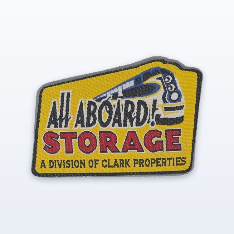
Custom text patches read well when the letters are tall enough, the font is simple, and the thread contrasts strongly with the background. As a general guide, embroidered lettering needs a cap height of about 1/4 in (6 mm) to stay readable, so short words in a bold sans serif on a high contrast background work best. If you need more words or smaller letters, a woven patch holds much finer text than embroidery.
This guide covers what makes lettering work in thread: size, fonts, spacing, contrast and layout, plus which construction to pick for slogans, names, numbers and long phrases.
Letter height comes first
The single most common problem with text patches is lettering that is too small. Thread has physical width. Below a certain size, the openings in letters like a, e and s fill in, and the word turns into a smudge.
Measure your text by cap height, the height of a capital letter such as H. As rough rules of thumb:
- Embroidered text: about 1/4 in (6 mm) cap height as a general minimum, more for lowercase and script.
- Woven text: holds noticeably smaller lettering, which is why woven labels can carry fine print.
- Text meant to be read from a distance (a back patch or a team name): plan for 1 in (25 mm) or more.
- Lowercase letters have a smaller body than capitals, so all caps usually reads better at the same size.
For the detail behind these numbers, see our guide to detail limits in embroidery artwork.
Reading distance matters as much as the minimum. A name on a chest patch is read from a few feet away, so modest letters work. A word like STAFF on the back of a jacket needs to be read across a room or a parking lot, so it needs letters several times taller. Decide where the reader will be standing before you settle on a letter height, and size the patch to suit the text rather than squeezing the text to suit the patch.
Mixed sizes are fine. A large main word with a smaller supporting line underneath is a common and readable layout, as long as the smaller line still clears the minimum.
Fonts that stitch cleanly
Fonts designed for screens often have very thin strokes and tight details. In thread, those thin strokes either vanish or get thickened, which changes the look of the font. The fonts that work best share a few traits.
Bold sans serifs
Even stroke widths, open letter shapes and no fine serifs make block and sans serif fonts the safest choice. They hold up at small sizes and read at a glance.
Slab serifs and varsity styles
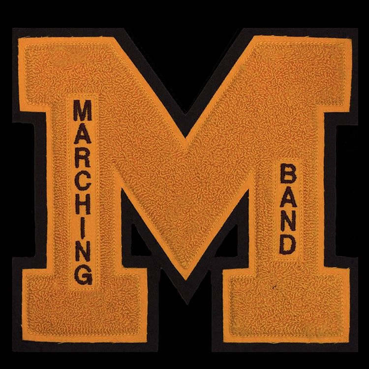
Slab serifs have thick, square serifs that stitch well. Varsity and collegiate block letters are designed to be bold and are the standard for team and school text.
Scripts, with care
Script lettering looks good in thread when it is large and the strokes are not too thin. Fine connecting strokes in a delicate script are the first thing to fail. If you love a script, use it for one or two words at a generous size.
Contrast and colour for readable text
Readable text is about contrast as much as size. Dark thread on a light background, or light thread on a dark background, is easy to read from across a room. Two mid tones, such as red on blue or green on gray, can look fine up close and blur at a distance.
A thin outline around each letter in a contrasting colour can rescue a low contrast combination, as long as the letters are big enough to hold it. On busy or patterned garments, a solid background behind the text keeps it legible.
Keep the number of text colours small. One colour for the main word and a second for a supporting line is usually enough.
Layout, spacing and word count
A patch is small, so every word competes for space. Fewer words at a bigger size almost always beat more words at a smaller size.
- One or two lines: the most readable layouts. Three short lines can work on a larger patch.
- Letter spacing: give letters a little more space than you would in print. Tight spacing makes stitched letters touch.
- Text on a curve: text around the ring of a circle patch is classic, but the curve squeezes the letters on the inside edge, so allow extra height.
- Margins: keep text clear of the border. Letters that crowd a merrowed edge look cramped.
If your phrase is long, try a wide rectangle instead of a circle. It gives text a straight baseline and more width to work with.
Which construction suits your text
The best construction depends on how much text there is and how far away it needs to be read.
| Text job | Best construction | Why |
|---|---|---|
| Short slogan or name, bold font | Embroidered | Raised, textured, classic look |
| Long phrase or small print | Woven | Fine thread holds smaller letters |
| Large team names and numbers | Satin tackle twill | Layered fabric letters read from far away |
| Varsity letters and mascots | Chenille | Thick tufted texture, bold shapes |
| Text over a photo or gradient | Sublimated | Printed, so any font size prints |
| Formal crest with a motto | Hand embroidered bullion | Metallic wire for ceremonial pieces |
You can compare all six on the custom patches page. For names on work shirts and uniforms in particular, our guide to custom name patches covers sizes and ordering a roster.
Common kinds of text patches
Most text patches fall into a handful of types, each with its own conventions.
- Name patches: a first name on an oval or rectangle for work shirts and coveralls, usually about 3.5 to 4 in (89 to 102 mm) wide.
- Title and department patches: a word like SECURITY, STAFF or VOLUNTEER, often used on the back or sleeve, and read from a distance.
- Slogan and quote patches: merch and gift patches built around a phrase, where the font carries the personality.
- Rockers and tabs: curved or straight bars with a club name or location, used above and below a center emblem. See our rockers and back patches guide.
Check the proof, then order
Spelling is the most common error on any text patch, and it is entirely avoidable. When the proof arrives, read every word letter by letter, check capitalization and punctuation, and confirm the font matches what you asked for. Nothing runs until you approve the proof in writing.
To get started, send us your text, the font (or a sample you like), the colours, the size and the quantity. If you are ordering names for a team, a simple spreadsheet with one name per row saves time. Quotes come back in 2 to 3 business days, and custom minimums from 100 pieces are confirmed on the quote.